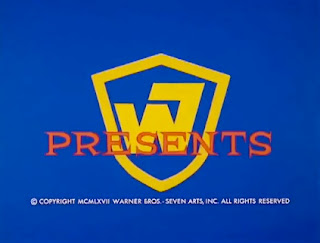
For a brief period in the late '60s, Warner Bros. was controlled by Ray Stark and Eliot Hyman's Seven Arts Productions, after they purchased majority rights to the studio from Jack Warner for $32 million. The house poster design style had a uniformity to it not alike the aforementioned Paramount style. The posters often feature art, colors, and fonts that are characteristic of the "psychedelic" era. The billing block below was usually black on white, with the same font and layout across the board.
Truth be told, the style does seem to be established prior to the Seven Arts takeover and continued after the company was sold to Kinney in 1969, but to keep this post somewhat contained, and because I adore the WB - Seven Arts logo and am fascinated by the years this era comprises, I chose to begin and end with the Seven Arts period.
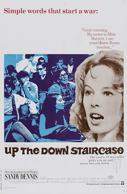
Up the Down Staircase is an example of the same layout in place just prior to the Seven Arts takeover:
Perhaps the most celebrated films produced by the WB in this era are The Wild Bunch, Bullitt, Bonnie and Clyde, Cool Hand Luke, with several other lesser-known, but highly regarded titles such as Petulia, The Learning Tree, Rachel, Rachel, The Rain People, and Wait Until Dark. Although the Seven Arts years were brief, they encompass times of great change within the industry and without...evidenced within Hollywood by the adoption of the new MPAA ratings system in 1968 and films such as Wild Bunch and Bonnie and Clyde, which were revolutionary and game-changing due to their more explicit, realistic depictions of violence and the ways in which their narratives seemed to echo or respond to the larger social context, particularly Vietnam and the anti-war movement, the concurrent women's and civil rights movements, and rapidly changing societal mores.
I've tried to place the following together based on similarities in use of color, collage, border, or generally similar vibe:

An attractive one that doesn't really mesh so much with the others aside from adhering to the artwork above / black on white billing block below:
Aside from the colors and the cleanliness of the layout, one of the quirks that I find pretty unique to the WB posters are the non-colored sketches that are sometimes part of the primary artwork and other times complimentary to the main artwork, which you can see on Cool Hand Luke and the following examples, some of which are post-Seven Arts:
A color example of one of the sketch style:
Some post-Seven Arts examples of this sketch technique, which also demonstrate the continuity of the WB house style:
Some more onscreen examples of the WB - Seven Arts logo:


2 comments:
Terrific post. I own about five of these, and just bought another one for THE GOOD GUYS AND THE BAD GUYS. And I thought I was the only one who noticed how great this company was at selling their movies! Thanks so much for this!
Thanks, Dean! So, which ones do you own?
Post a Comment