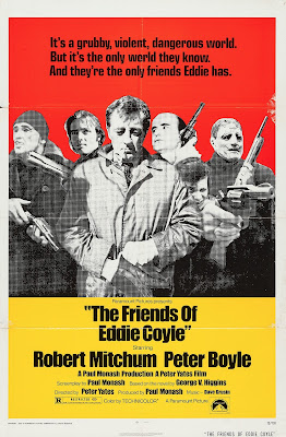
When Olivier Assayas' Carlos came out a few years ago, I immediately gravitated towards the great retro one-sheet, designed by Sam's Myth, that accompanied its U.S. theatrical release. The poster reminded me of the clean, attractive, and almost uniform design of so many Paramount titles of the late '60s - '80s. These would often have a large square image, with black on white billing block below, all surrounded by a white border. This layout isn't limited to Paramount by any means, but it seems more prevalent in Paramount titles and for a longer period.
My friend and Brooklyn neighbor Adrian has written about this style and era, with a focus on thriller and espionage titles, while not calling particular attention to Paramount or any other studio, but rather influential ad man and designer Stephen Frankfurt, at his Movie Poster of the Week column here and here. Perhaps it's Frankfurt, with his iconic designs for Rosemary's Baby and Downhill Racer for Paramount who's most responsible for laying the foundation for the Paramount key art layouts for the next couple decades.
The de-saturated, two-tone treatment of the image on the Carlos poster is specifically reminiscent of these one-sheets:


9 comments:
I've never heard of Sheila Levine or the dove before but now I've got to hunt those two down.
Also, you clearly have to program a rep series based on several or all of these titles .
I've heard of both films, but never seen them...I saw part of THE DOVE on tv when I was a kid, but that doesn't count.
Would be a cool rep series, though I don't know if any programmers care about poster design minutia as much as I do.
great post. i never put it together that paramount did so many great posters back then.
Thanks, MrJeffery! Pretty amazing run and, obviously, I haven't posted all of them.
Love this. i'm sharing it.
Thanks, Meep! I wish I owned more of the glorious one-sheets in this post myself.
A terrific post. I had not realized that these were all one studio. Have you found examples of other studios co-opting the Paramount style?
Thanks, Adrian! Glad you enjoyed.
On your own article about Frankfurt (or, is it Gips who should be credited?), there are examples such as ALIEN and EMMANUELLE, which have the same or very similar template.
Definitely seems like other studios, such as WB, have similar layouts--squarish image with billing block below (usually black on white) and clearly defined borders--in the late '60s - early '70s, which you can see in iconic posters such as BULLITT or DIRTY HARRY. Columbia does it at the same time, with a couple examples being GETTING STRAIGHT or BOB & CAROL & TED & ALICE. Or, UA with MIDNIGHT COWBOY.
Post a Comment